Salina

A B2B solution for third-party authentication
Project Overview
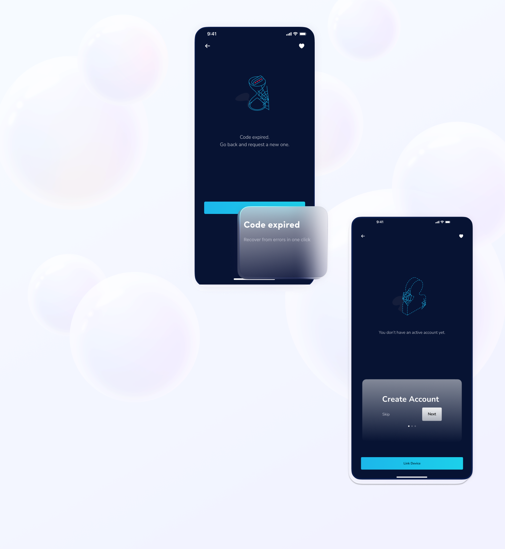
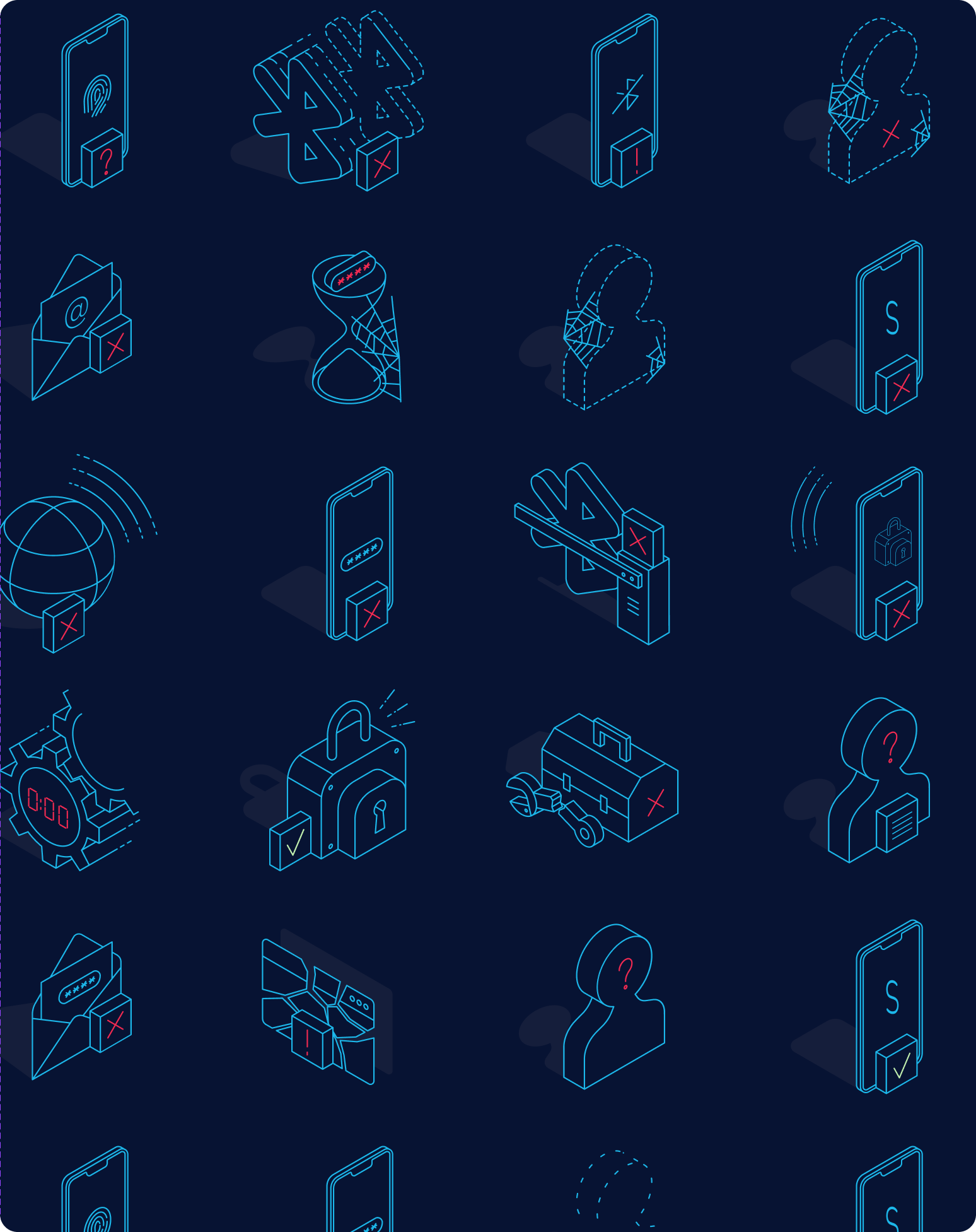
Salina revolutionizes your organization’s authentication by harnessing mobile biometric technology to deliver secure, effortless access to internal applications. Say goodbye to password resets and IT bottlenecks—welcome streamlined workflows and stronger security.Simple. Secure. Designed for your business.

When designing Salina, it was clear that its technical complexity demanded isolating complicated processes away from the user. In this project, crafting precise writing and intuitive flows was essential to ensure a seamless experience.
‍.
My Contributions
When I first met Cuantix they didn't have a clear design system, not even a functional style guide able to reflect their brand. I was able to engage the team into a functional design process. Two of the main features we were able to build for the platform were the Survey builder: a tool to create surveys linked to stardardized indicators and the Beneficiaries module, which helped them to track individually beneficiaries impact.
The Challenge
How can we create seamless, coherent communication between the system and users while enabling smooth, uninterrupted workflows across multiple devices simultaneously?
When I began to think about the optimal conversation between the system and the user, I detected three main challenges:
Technical Context
Biometrics are widely used to control access to digital resources, reducing password fatigue, enhancing user experience, and easing the burden on company support and IT teams—who traditionally handle password resets and manage complex password systems

Salina is a SAAS and users can easily enter Salina's environment through a common browser. However, the entry point for the user could be another application in which they intend to authenticate. The first time they try to enter these applications in their work environment (think tools like Github, Slack or Jira), they should activate their account by providing their work email and validate it through a code they will receive in their email.

Salina is a SaaS platform that users can access easily through a standard web browser. However, the user’s entry point might be a different application where they need to authenticate—tools like GitHub, Slack, or Jira, for example. The first time users log in to these applications within their work environment, they activate their account by entering their work email and validating it with a code sent to their inbox.

Up to this point, the process is straightforward and familiar.

Next, users activate their account on their mobile device, where biometric tools like Face ID or fingerprint recognition enable seamless, password-free authentication going forward.
I started by sketching user flows for the key interactions with the platform. Mapping out these flows early in the development of a new feature helps streamline the creation of state screens, such as empty states or edge cases.

Ultimately, this represents the happy path of the authentication process:
A flow diagram explaining user and computer interaction
Detail of the flow for linking devices, account, and pair Bluetooth with annotations

User Testing

We used our flows as maps to create our first mobile screens. By doing so, still with placeholder illustrations, we began to test with users what we were creating to understand any friction we might be adding to the interaction.

Before going deeper into the visual design, we planned Usability tests for 5–10 users.

We gave users a set of main instructions and created a script to be able to explain the activity before putting hands on the job. This helps us to be able to watch the users interacting with the prototype without feeling the urge of give away hints.

Introducción al Testing

Gracias por aceptar participar en esta evaluación. Nuestro objetivo es ver qué tan fácil o difícil de usar es este producto digital. Te queremos avisar que nos gustaría grabar tus reacciones y opiniones. Es completamente con una finalidad de estudio, los testeos son anónimos y nadie aparte del equipo de investigación los verá. Una vez que nos des tu consentimiento, comenzaremos a grabar y te pediremos que lo repitas, para que quede constancia de tu aprobación.De todas maneras, es posible que te pidamos que nos aclares algunas afirmaciones de vez en cuando.

Introducción al Producto

Esta actividad no busca probar tu habilidad como usuario sino la habilidad de la empresa de diseño de aplicaciones para generar una plataforma clara, intuitiva y simple. Por eso mismo te pedimos que seas lo más crítico posible con el sitio, lo que encuentres bueno, malo o que falta. Todo eso nos servirá para mejorar la navegación.

Algunas cosas que debes saber sobre tu participación

- No se trata de una prueba de tus capacidades, lo que se está probando es el sitio. Así que no te preocupes por cometer errores, cada error que encuentres nos ayudará a mejorar nuestro proyecto.
- La manera en que esto funciona es que tu en todo momento me manifiestes lo que estás pensando, ya sea esta una buena o mala impresión sobre lo que estás viendo.
- No hay comentarios correctos o incorrectos. Realmente sólo queremos saber si hemos diseñado el sitio apropiado para ti.
- Si alguna vez sientes que estás perdido o no puedes completar una tarea con la información que se te ha dado, por favor házmelo saber. Te voy a preguntar qué habrías hecho si estuvieras en el caso real y luego decidiremos si te ayudo a encontrar el camino correcto o definitivamente saltamos a la siguiente tarea.
- Como te mencionamos, estaremos grabando esta sesión para complementar nuestro análisis si es necesario. Tu nombre no será asociado con los datos o conclusiones de esta evaluación
- Por último, por favor, usa el sitio como lo harías en tu casa o tu oficina. Cuando yo te pida que busques información, hazlo tan pronto y tan exactamente como sea posible.

¿Tienes alguna pregunta o comentario que hacerme antes de comenzar? Comencemos…

2. Users were encouraged to finish three tasks in the prototype. The researchers asked the users to think out loud while they were interacting with the product and kept silence during the activity.
Text with the instruction for each task in usability testing
From these user testing we found some insights:
We could add some delightful yet funny illustrations and tone to lighten up the common authentication task
  • It was not clear in several steps how to recover from errors
  • Our ‘tone’ was still too technical for beginners. We had to simplify the way we communicate any possible error from the user
  • We had to set a first set of instructions when activating the account to help the users understand they needed biometric tools and Bluetooth connection from the desktop to their mobile
  • We could add some delightful yet funny illustrations and tone to lighten up the common authentication task

Final Prototype

We were able to create a smooth, simple, and fun application for authentication, taking into considerations all possible human errors and system crashes to craft a seamless interaction between the app running in both devices and the users.
A set of wireframes with the final design of the Desktop versionA set of wireframes showing the final design for mobile version

Authentication - Bluetooth Connection Error

Authentication Prototype Flow